Guide to Typography in Web Design
There’s a lot more to words than meets the eye. If you’re researching what is typography in web design you might already know how crucial the style, appearance and structure of the lettering you use is in terms of the reader experience.
It’s about more than simple clarity, more than merely being readable. It’s also about the different emotional responses that various typographic styles trigger. While it’s usually unconscious, our responses to typography can powerfully influence the decisions we make in all sorts of contexts, including web pages and every other kind of content, online or offline. As a highly experienced B2B website design agency we understand the importance of typography in web design. By the end of this article, so will you.


What is typography in web design
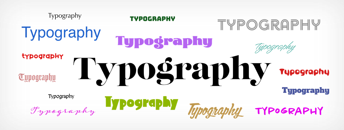
First, let’s explore what is typography in web design. The word ‘typography’ describes arranging letters and text in such a way that the message is legible, clear, and visually appealing. This involves a wealth of different aspects including the font style, its appearance, and the structure. Together they inspire certain emotions and put across specific messages. By doing so, typography brings words to life. Create a message in a certain font, in a specific way, and the impact will be surprisingly different from what it’d be if you did things differently.
This clearly reveals the importance of typography in web design. Getting it right can mean lower sales conversion rates, more people clicking away part-way through the content, and a less-than-ideal look and feel for your brand, products, and messaging. Great typography sits at the heart of buying decisions and brand recognition. It can either hold someone’s attention or drive them away.
Powerful typographical treatment delivers a hard-working visual hierarchy as well as a balance that pleases the eye. It sets the scene and helps set the tone. Done beautifully it informs and guides readers. It keeps everything clear. It supports excellent accessibility. It acts to enrich people’s perception of products and services. And you create an exceptional user experience from start to finish. Get it wrong, on the other hand, and you can leave people confused and frustrated.
All this matters more than ever in a world where web designers have a huge choice of fonts and typefaces at their fingertips. Because the world of typography is so diverse, the choices made by web designers matter more than ever. The importance of typography in web design is clear.


Challenges of web typography
As you can imagine, typography in web design comes with significant challenges. So what are the challenges of typography in web design? Take screen size, for example. You can create a stunning piece of typographical communication. It displays perfectly on your screen – but what about the changing dimensions you get when viewing content on small and large screens? It can ruin the effect. So can screen resolution. Depending on where your audience lives they might have the latest gadgets or are still stuck with older technology. You’ll need to take that into account. And how about brightness? Some people’s screens are going to display surprisingly different colours to those you intended. You need to design typography to meet every need.
Make it too complex and you’ll lose people’s attention. A messy message using multiple fonts isn’t easy to read, nor is multi-coloured content. All-capitals in the wrong place makes it look like you’re SHOUTING. And when the font is too small, people will give up rather than strain their eyes trying to read it. The text’s size and height often enjoy a specific relationship you shouldn’t mess with. Colour has an impact on all of us. Red says danger, green often means go, orange hints at heat. And the colour contrast matters, too. Place small red text over a black background and many people will struggle to read it, even those with excellent eyesight.


Considerations for typography on your website
Thankfully there are some handy typography rules for web design. As experts in typography for the web, how do we recommend you go about choosing the perfect typeface or faces for your website?
First, think about the impression you’re making around personality. A funeral director, for example, would be best off choosing deep shades, maybe purples, greys and black, rather than sunny yellow and bright pink. And a fruit wholesaler would want something fresh and vibrant, perhaps fresh greens, pinks and reds rather than dark colours. Choose the colours according to the way you’d like users to feel, bearing in mind your reason for existing – your products and services.
Function is vital. It’s no good designing a website that’s absolutely beautiful to look at but impossible to read. You’ll only end up with people getting lost on the site, becoming exasperated, and clicking away to find something clearer and easier to digest.
Tone matters as well. The tone of your message should be reflected by the font. Let’s take those funeral directors as an example again. The tone of the site will be serious, compassionate, calm and professional. And that means choosing a serious, professional font. The last thing you’d use is Comic Sans! On the other hand if you’re selling something highly creative or emotive, a fancy or decorative font might help you set the scene in an inspiring and relevant way… but only when it’s readable.
Contrast is essential. People need to be able to pick the words out from the background without any effort at all, the same way we do with a physical book. Contrast also helps convey ideas more clearly, and highlights the parts of a message that are the most important. And consistency keeps things from getting confusing.
Never forget performance. Again, your pages could look fantastic but if your typefaces aren’t web browser-friendly, they will default to something that is. It’s always best to use font libraries where you know for sure every typeface you use will display the way you want it to.
How about white space? Negative space is actually almost as important as typography because it can profoundly affect the readability of words. If content is cluttered and crowded, it’s a lot less easy to read than if it’s laid out in a free, specious way. And when you align your typography well, adding the same size and space between elements like the logo, header and the body text will improve the user experience no end.


Web friendly fonts
Now you know why it’s so important to get it right, let’s explore web friendly fonts. As a general rule fonts without a serif, called sans serif, are clearer for readers. A serif font includes little curls that stick out, for example Times Roman. Serif fonts are almost always easier to read in print, which is why Times Roman is the most popular font for books. But they’re trickier to read on screen, which is why sans serif fonts are the norm on-screen.
Monospace fonts feature the exact same spacing between all the characters. Cursive fonts look a lot like handwriting. And Fantasy fonts are highly stylized and decorative, which means they can be difficult to read at a glance, taking more effort. Sometimes it’s worth it, other times not. It depends on the context.
MS stands for Microsoft, revealing the font was created with digital design in mind by Microsoft. Web-safe fonts automatically adapt to any browser and any device. And that means you know for sure they’ll display the way you intended no matter how the user consumes the text, even if they don’t have the particular font uploaded to their device.
Here’s a list of 18 of the most popular web-friendly fonts:
Arial (sans-serif)
Arial Black (sans-serif)
Verdana (sans-serif)
Tahoma (sans-serif)
Trebuchet MS (sans-serif)
Impact (sans-serif)
Times New Roman (serif)
Didot (serif)
Georgia (serif)
American Typewriter (serif)
Andalé Mono (monospace)
Courier (monospace)
Lucida Console (monospace)
Monaco (monospace)
Bradley Hand (cursive)
Brush Script MT (cursive)
Luminari (fantasy)
Comic Sans MS (cursive)


Common Mistakes
You can see why clear web design typography rules are so useful. So what common mistakes do we recommend you avoid like the plague? For a start, classic typefaces are classic for a good reason – they work hard and do an excellent job in most contexts. Novelty fonts are all very well but it’s a risky move. If it’s popular, ie. in the list above, use it. If it’s obscure, maybe not.
Stick with the same font but vary the weight. The best pre-installed and classic typefaces include a choice of weights. And that makes it really easy to create beautiful, unified text, even long text like books. Using just one font in a variety of ways for your quotes, titles, subheaders and more helps the user find their way around your content easily and quickly. And when you use it to create a user-friendly hierarchy, it supports users even more.
THE MAIN HEADING MIGHT BE IN BOLD OR CAPS.
The subheads might be a smaller size but emboldened.
Smaller headings can be in semi-bold or italic.
Adjusting the leading, in other words the line spacing, stops your content from looking all squashed up, a neat typographical design tip. Adding clean open space makes things so much easier to read. Tracking, which involves spacing the letters elegantly, will also help with legibility. Align your paragraphs in the way people expect for even better clarity. And always align them the same way, ideally left or right rather than central, which is hard to read.
Always prioritise readability over style. Avoid hard-to-read fonts. Keep the font a size most people will be able to read, not too small. You’ll need at least 10 point text to be readable, ideally 11 point. Then there’s kerning, which means changing the spacing between letters or characters to boost the aesthetics or improve the visual symmetry. It can make a huge difference which, while people won’t necessarily be conscious of it, will make your content so much more readable.
A great tip for improving your kerning process is to flip type upside-down before adjusting the spacing. This way you won’t be distracted by the content of the type, and you can focus solely on the visual symmetry of the letters instead.
Once you’ve avoided all these potential problems, it’s wise to check everything – then check it again. The final tweaks that make everything perfect are the icing on the user cake. Think about aligning your margins optically, strengthening headers and subheads by using capitals, and indenting the first line of long paragraphs to give people a proper break.

The web design typography rules – revealed!
It’s complicated, isn’t it! That’s why you need to be aware of all the ins and outs of web design typography rules. And that’s why we go to such lengths to make sure every single piece of online content we create for our customers is perfect in every way as regards the typography side of design. If you’d like to tap into our expertise around the importance of typography in web design, we’ll be delighted to explore the potential with you.
Get in touch by phone on 01844 888 777, email us at hello@intuitiv.net or use our contact form.
View more
Guide to Typography in Web Design
15th February 2023
What is mobile first website design?
15th February 2023
Find out what you need to know about Umbraco, what it is and what the CMS is used for.
A Beginner’s Guide to Understanding Umbraco
15th February 2023
Create something special
Give us a call on 01844 888 777 or email hello@intuitiv.net


